Overview
A dashboard redesign for a B2B third-party housing property inspection platform to maximize current property managers' workflow and efficiency.
My Role
Project Management
UX Design
UI Design
Prototyping
Usability Testing
Duration
Four weeks
Tools
Figma
Miro
Team
Rong Cong
(UX Designer)
Anna Hong
(UX Designer)
Wesley Hunt
(Founder & CEO)
The Challenge
Most houses built in the U.S. today are in planned communities, where they have their own sets of rules and regulations that homeowners need to follow (HOAs). Property management groups oversee these communities, however, based on national reports, there’s a lack of property managers. In addition to the excessive workload, managing the communities and keeping track of HOA violations and community work orders is a challenge they are currently facing.
To create the violations and work orders, most property managers currently walk or drive through their communities, physically write notices, take photos on their phone, later input the notice information on a device, and send them out by postal mail and/or digitally to homeowners or vendors. Especially in communities of over 1,000 homes, this biweekly or monthly process is extremely time-consuming.
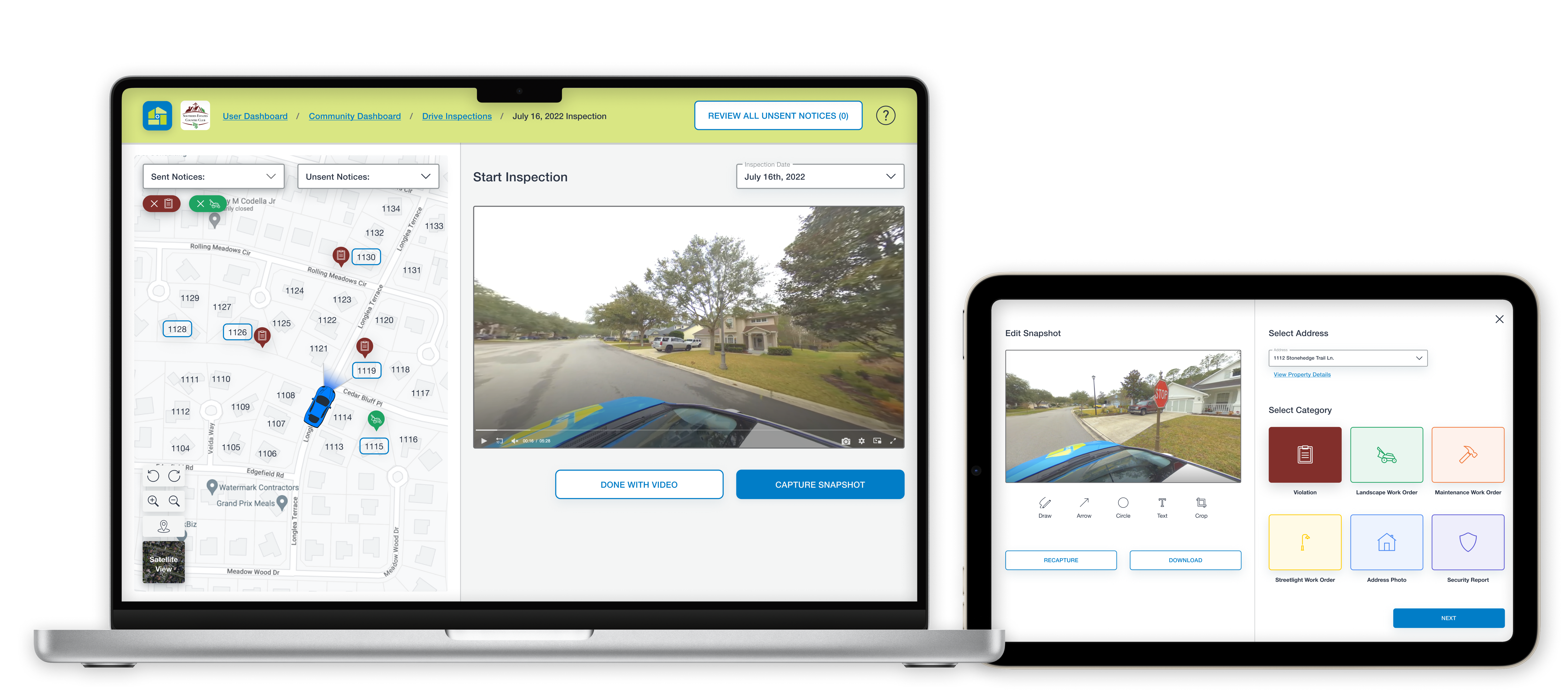
Compliance View 360 is a B2B third-party property inspection platform to bring the community to the property managers easily without labor intensive, on-site physical inspections. The company is the world’s first GPS-driven system; with the use of vehicles equipped with 360-degree cameras to capture communities’ surroundings, property managers are able to view these uploaded video recordings and log and send notices directly on the software. The technology they currently use to manage properties (specifically the dashboard screen) needed to be updated and improved in order for the property managers to work even more efficiently.
Business Goals
Based on previous research and analytics, the goal of the product’s dashboard is to view video inspections by date, log violations/work orders in the community, and create notice letters for the homeowners/vendors.
I was brought on with two other UX Designers to design version two of Compliance View 360’s dashboard, with the aim to:
- make improvements to the dashboard’s flow.
- refresh the dashboard’s interface for a desktop/laptop platform.
The Solution
Compliance View 360’s aim with their product is to improve project managers’ workflow and efficiency. Through a restructured inspection dashboard and updated style guide, we proposed new designs of the dashboard to maximize current users’ experience with the software.
Restructured Inspection Dashboard
The workflow was redesigned to be more efficient and effective for users, in order to allow for smoother, more intuitive navigation.
Updated Style Guide
Standard guidelines for fonts, colors, and icons, as well as components such as the header, buttons, and text fields were clearly defined to create more consistency.
Discover
Before diving into the research phase, my team and I dedicated the first week defining the project scope with the client. Given the time restrictions, we created a scope and timeline to manage our time and deliver realistic results to the client.
Existing User Feedback Analysis
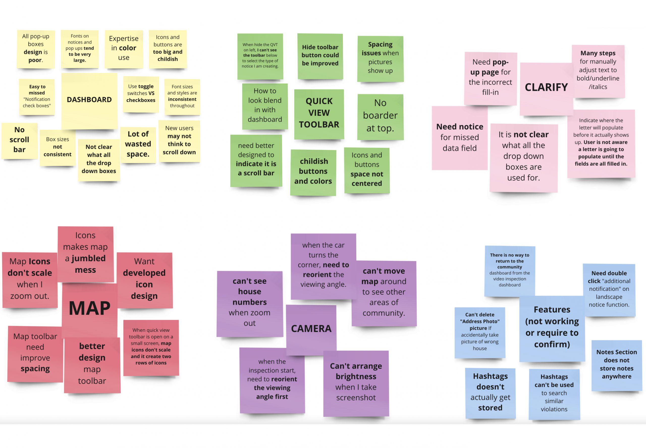
We began the research phase with analyzing existing user feedback given to us by the client. This feedback was vital for us to understand the current problems at hand. We moved these notes from users and grouped them in the form of an affinity map.
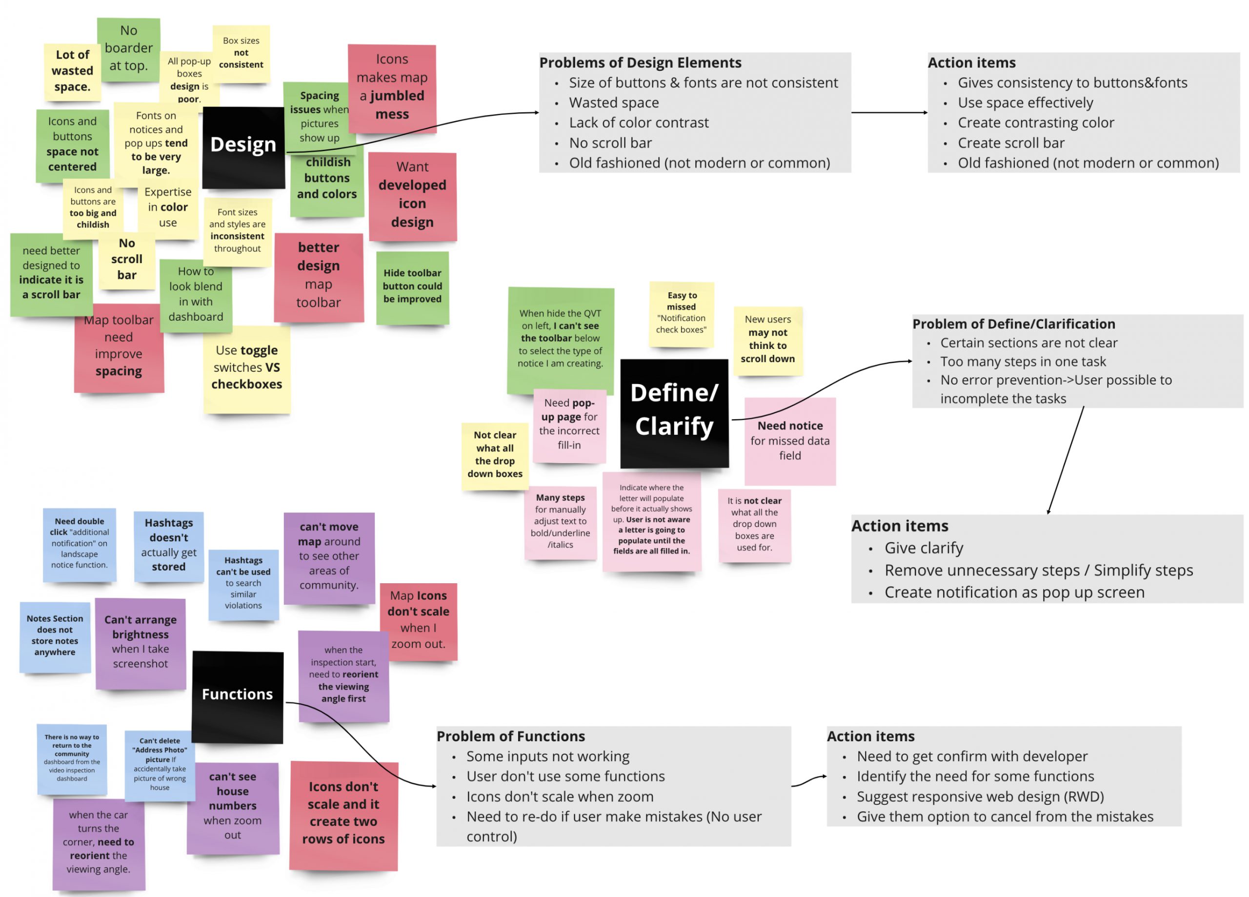
Through this, we discovered three common issues that users had with the current dashboard:
- Clarity and definition - ex: too many steps in one task, and it’s easy to make mistakes.
- Design elements - ex: sizes of buttons and typography are inconsistent, and interface is outdated.
- Functions - ex: some input fields don’t work, and icons don’t scale when users zoom in/out of the map.
Competitive Heuristic Analysis
The client had mentioned two specific competitors: HOALife and CINC Systems, of which we decided to analyze the flows and to conduct a heuristic analysis. We focused on three main heuristic principles in order to evaluate the pros and cons of the three products; in addition, to identify any market gaps.
Journey Map and Existing User Flows
To further understand and address the users’ needs for our redesigns, we created a journey map. This also helped us hone in on a problem space for our project, as redesigning the entire product wasn’t possible with our tight timeframe.
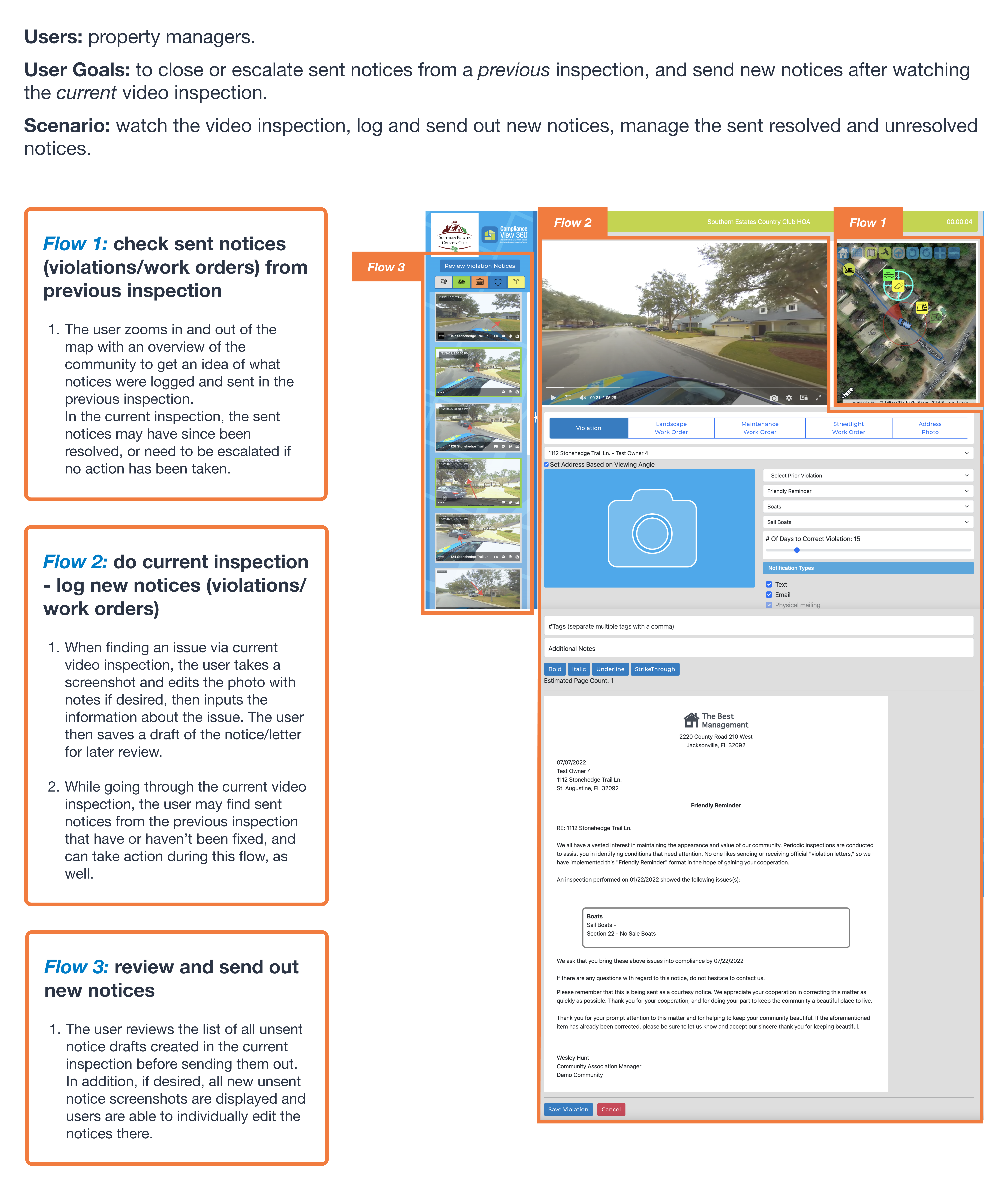
Journey map insights:
The map is essential to locate sent notices.
Logging new notices, as well as editing them before sending them out are two key tasks.
The logging process follows the driving route (users watch the video and log notices chronologically).
Easy access to review all the draft notices is important.
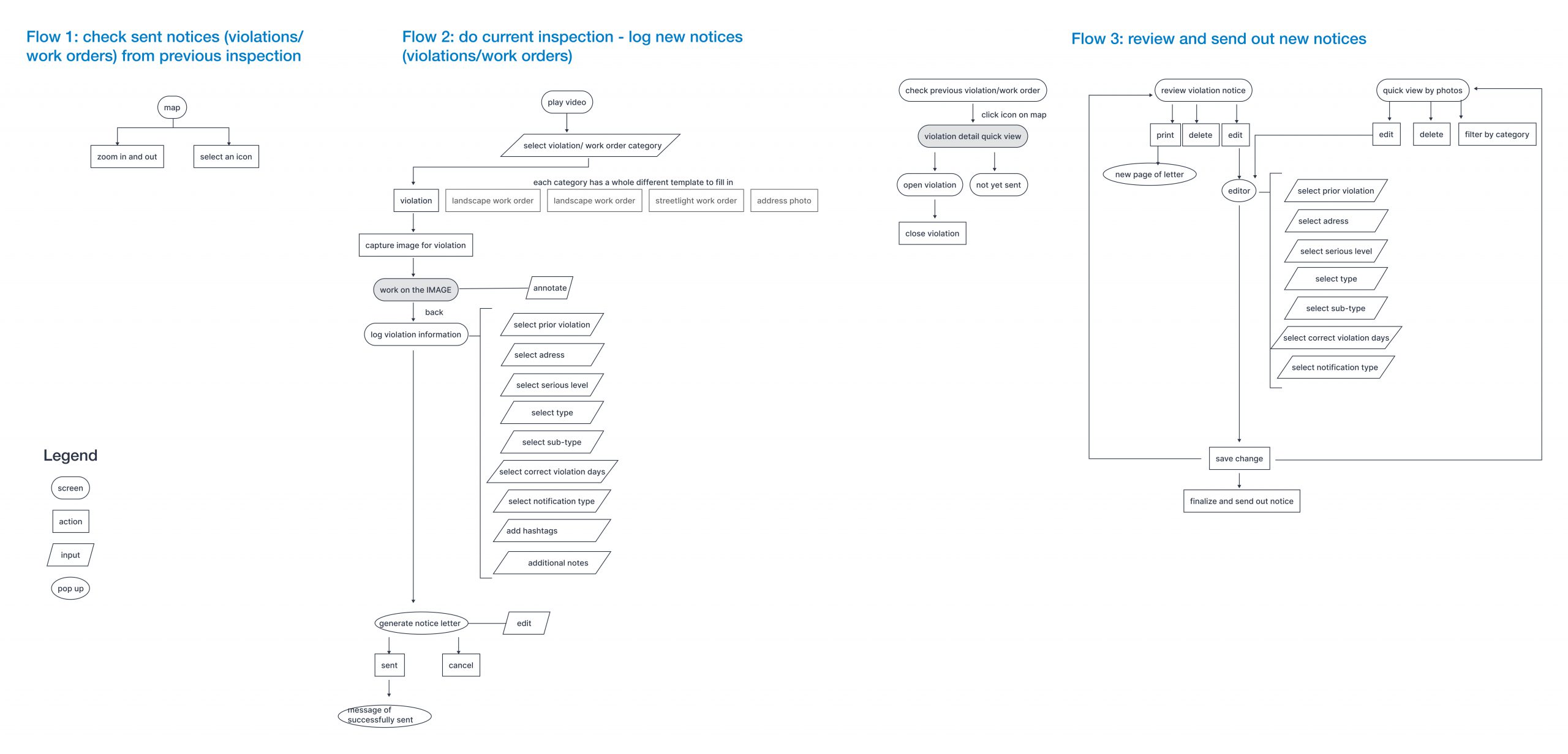
In defining the three flows to focus on, we first created user flows of the existing product for these three red routes.
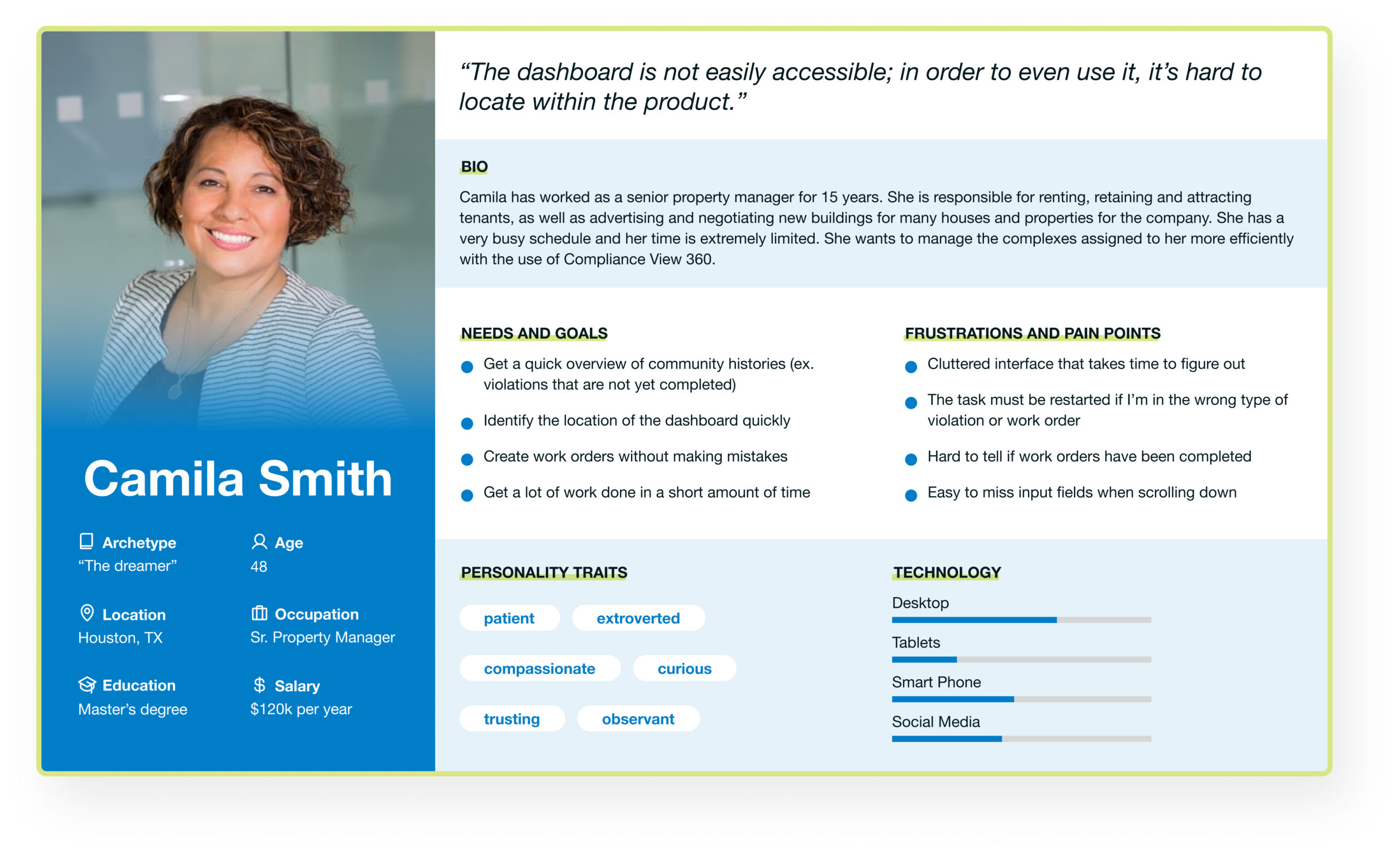
User Interviews
Our final step in understanding the existing product and its successes and users’ frustrations was to conduct six remote interviews with users who currently use the product. We asked them general questions such as how they use the product for their work, then asked users how they complete our three focus flows. In addition to the qualitative data, we asked for quantitative feedback using customer satisfaction metrics.
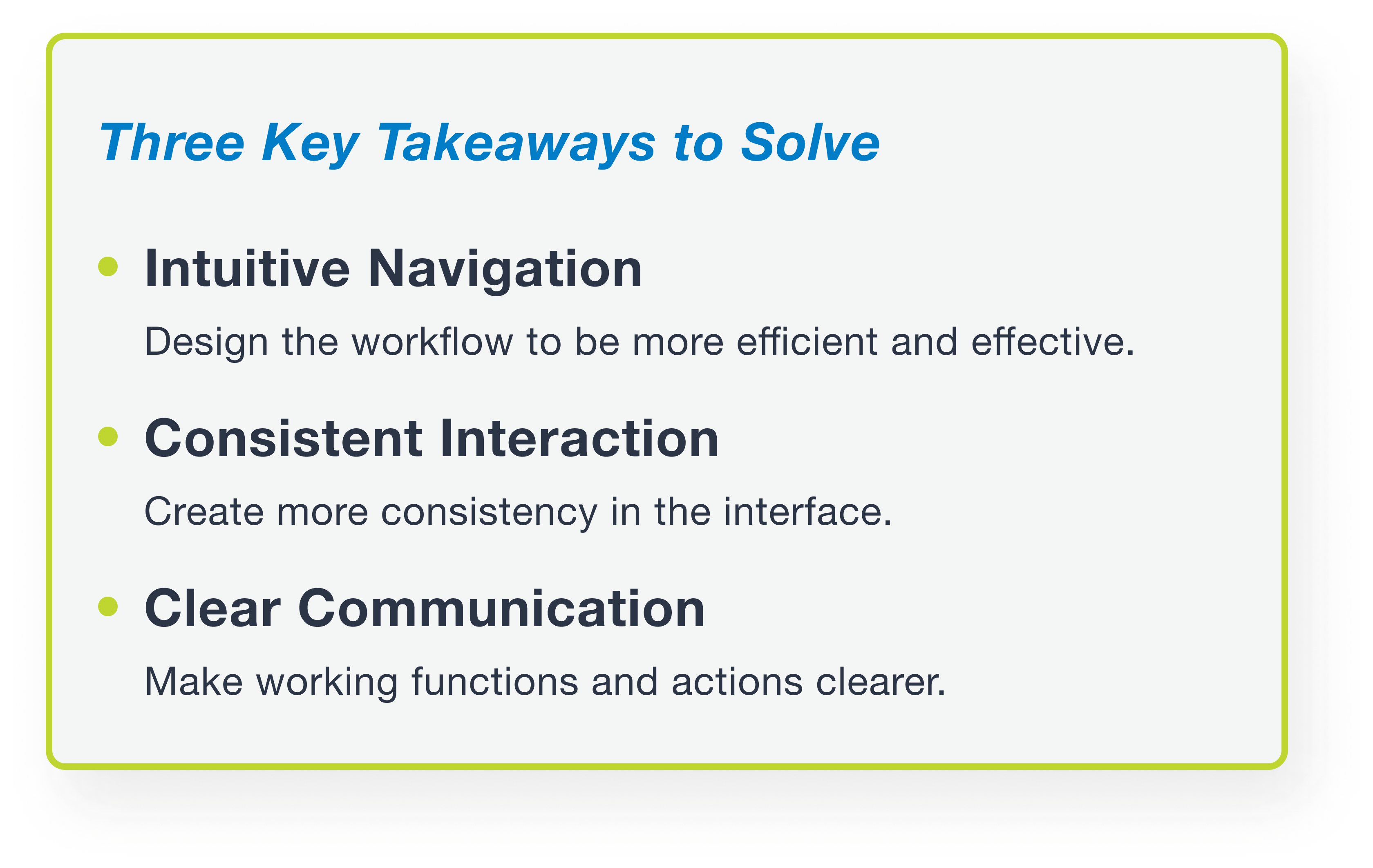
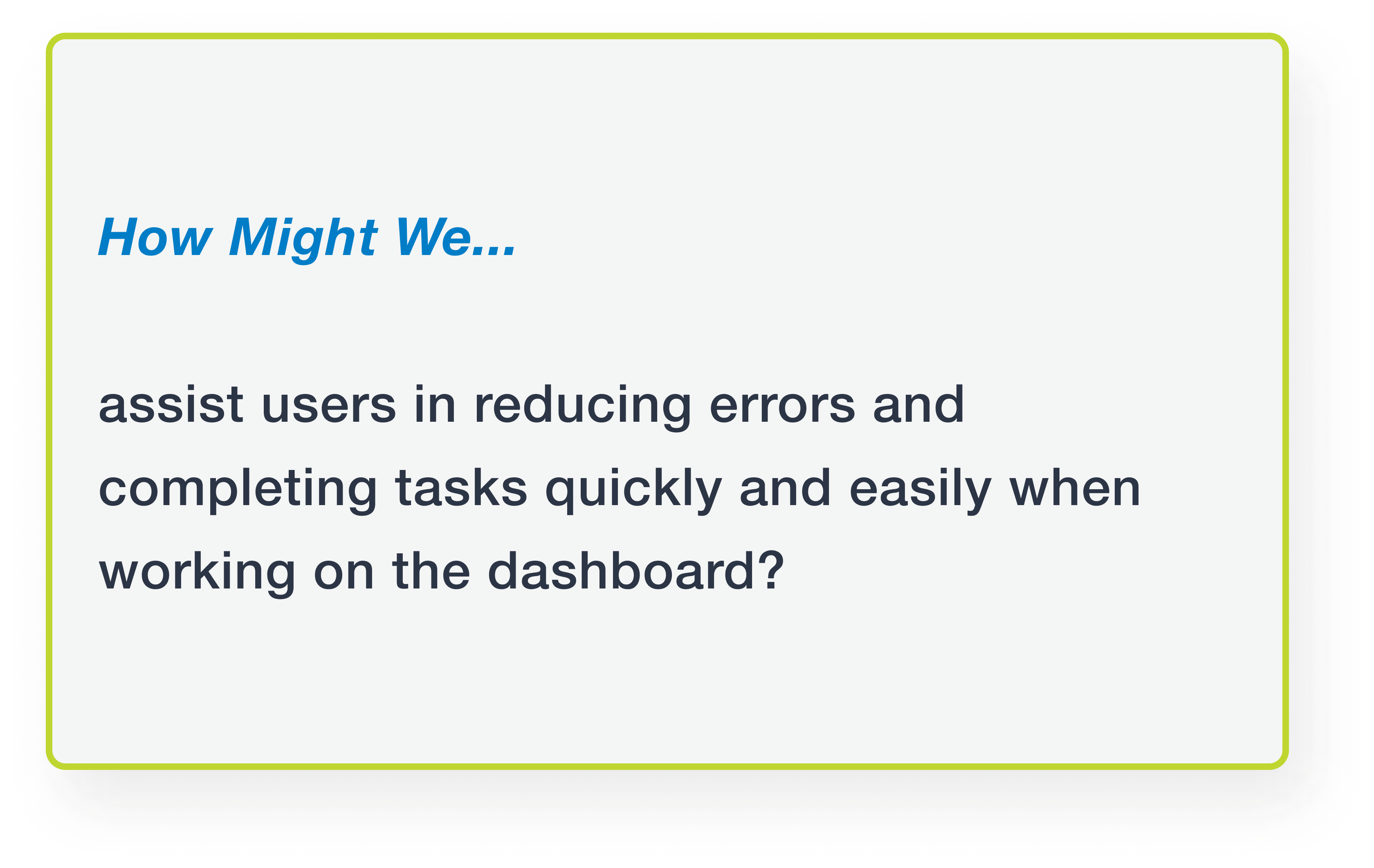
From these four methods of user research, we defined the three key takeaway problems that we wanted to solve, and developed a How Might We statement.
Proposed User Flow
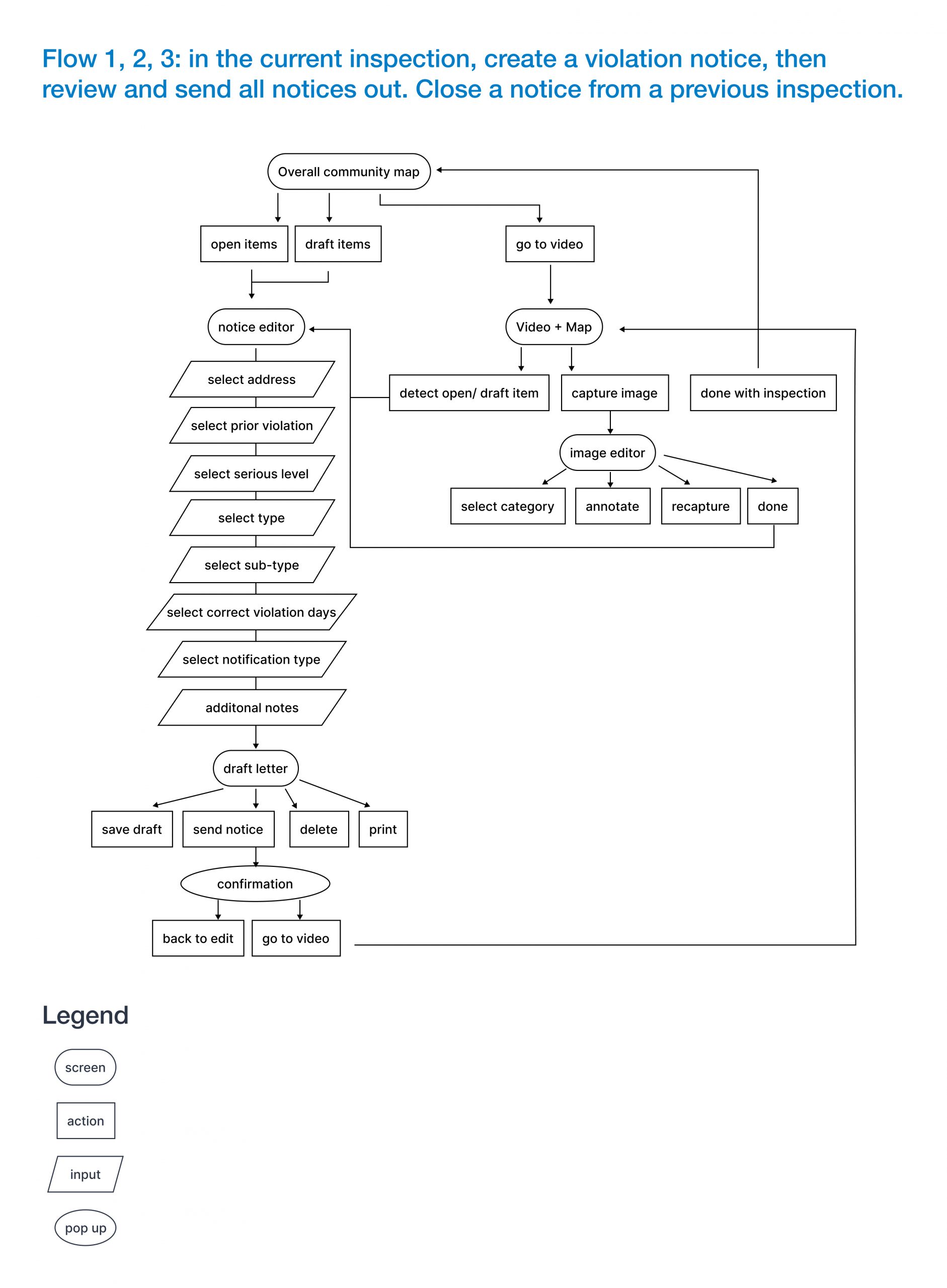
After synthesizing all of our research, we came up with one user flow that encompassed the three red routes to focus our designs on. This was in the hope of creating a more intuitive navigation for more efficiency. We focused our flow on specifically creating a new violation.
Design
Low Fidelity Wireframes
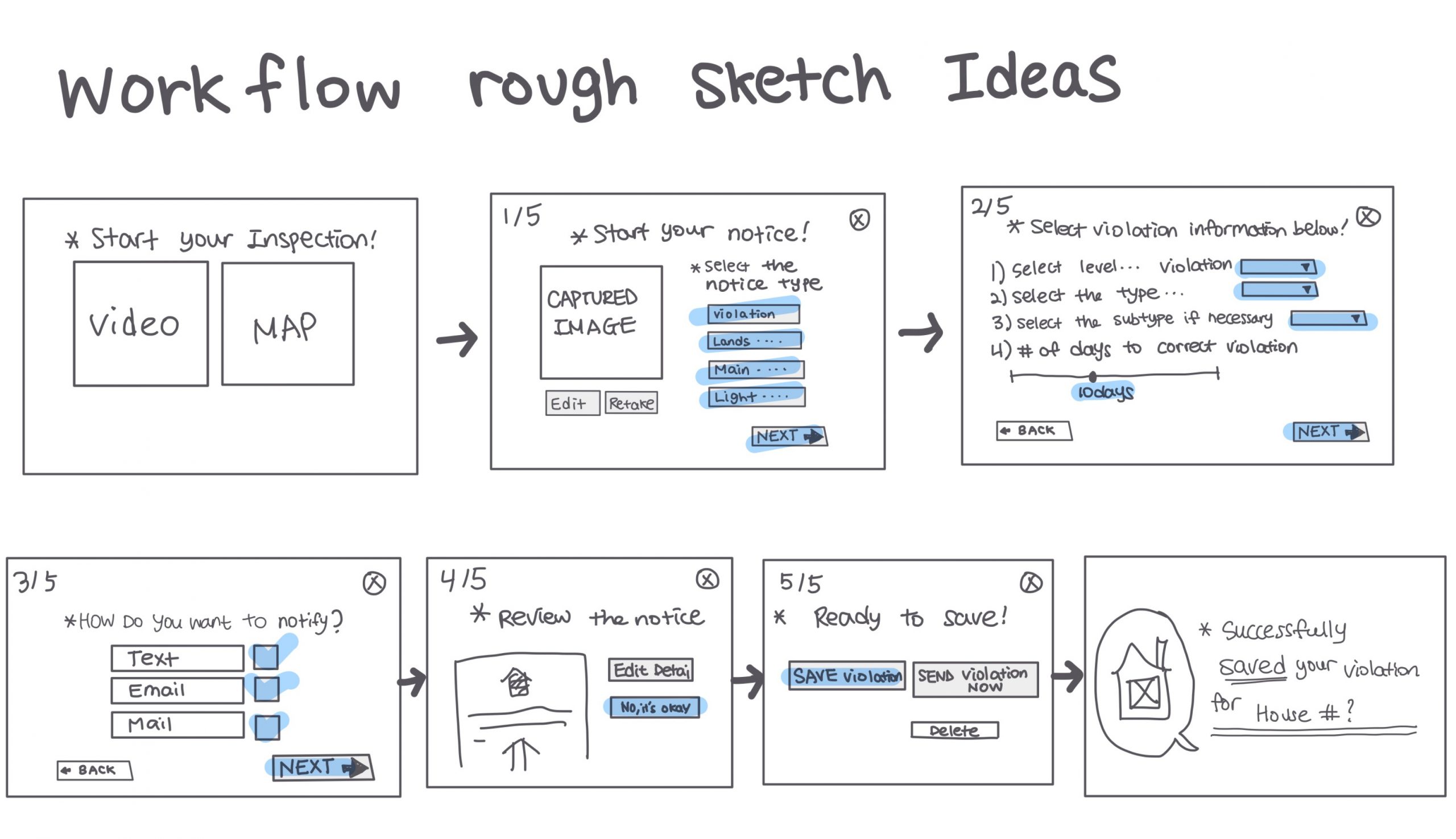
After brainstorming together, we finalized our low fidelity wireframes and prototype for usability testing. In the wireflow and prototype, we included the two existing screens that lead up to the dashboard that we worked on to understand how our proposed screens would flow from beginning to end.
Style Guide
While working on our low fidelity wireframes, we also created a style guide based on the existing company logo, colors, and typeface. This was to ensure consistent design and interactions were applied throughout the interface. We also added success and error colors, as users mentioned they unintentionally made errors with the existing product.
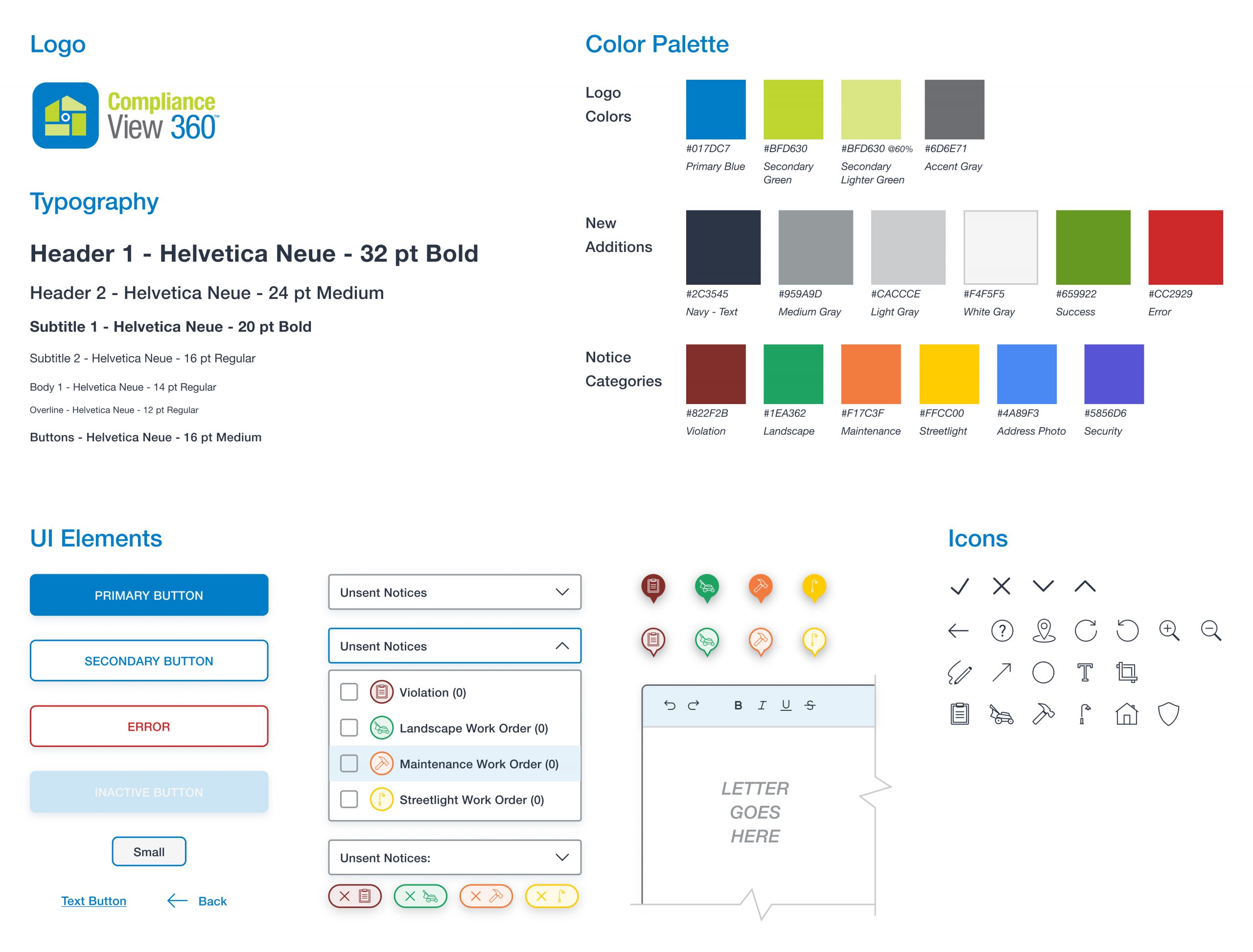
Style Guide
High Fidelity Screens
We applied the style guide we created to our wireframes, and built out all screens necessary in order to obtain feedback from user testing.
Validate
Usability Testing
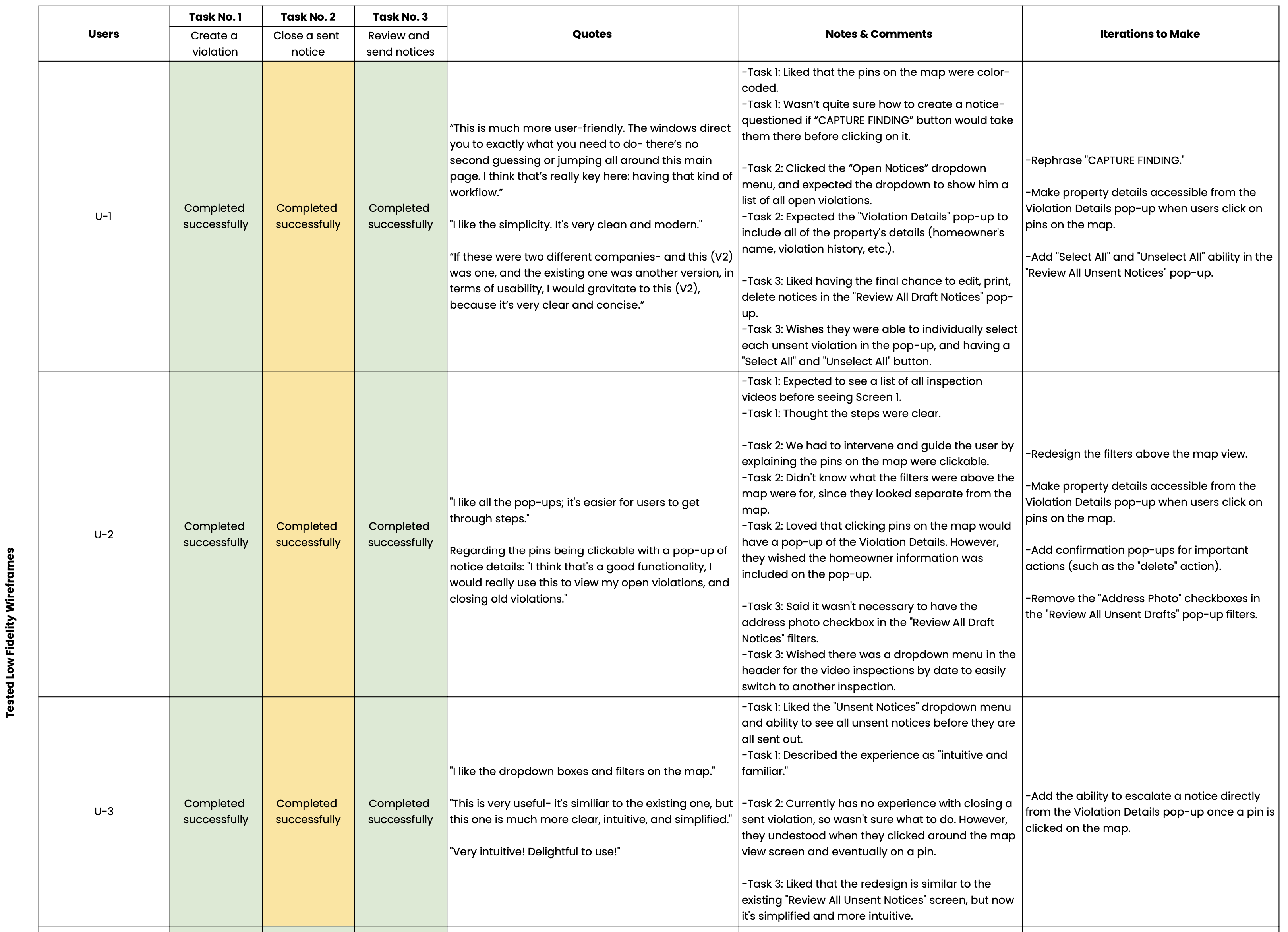
To manage our time more efficiently, we tested our low fidelity wireframes with four users, and our high fidelity screens with two users, all in a moderated, remote format. We chose participants who were all current users of the existing product, in order for us to measure success within our limited timeframe. We prepared three tasks for the users to complete:
- Create a violation notice in the most recent video inspection.
- Assume all notices from the video inspection are completed, and review and send all the notices out.
- Assume a sent notice from a previous video inspection has now been completed, and close that notice.
To synthesize our findings, we created a spreadsheet and identified the common usability issues. To our surprise, there was no one issue that users encountered collectively. We only had a few minor usability issues that we needed to update in our final mockups.
We also asked the users two questions for quantitative feedback in their experience using the existing dashboard and our redesigned dashboard Version Two.
- How satisfied were you with your experience, on a scale of 1-5 (5 being great)?
- How likely would you recommend this product to someone in the industry, on a scale of 1-5 (5 being highly recommend)?
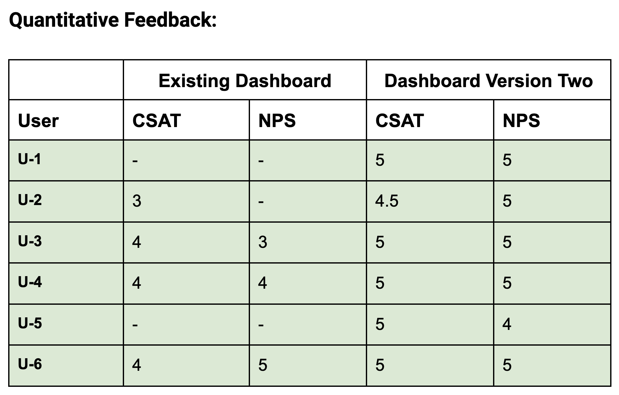
These metrics were helpful for us to measure success- and we were pleased with our results!
Iterated High Fidelity Screens
We made changes to the designs per usability tests and general client feedback (such as wording and style guide). Below are the main screens of the low fidelity wireframes we sketched out (and tested with four users), and iterated high fidelity screens.
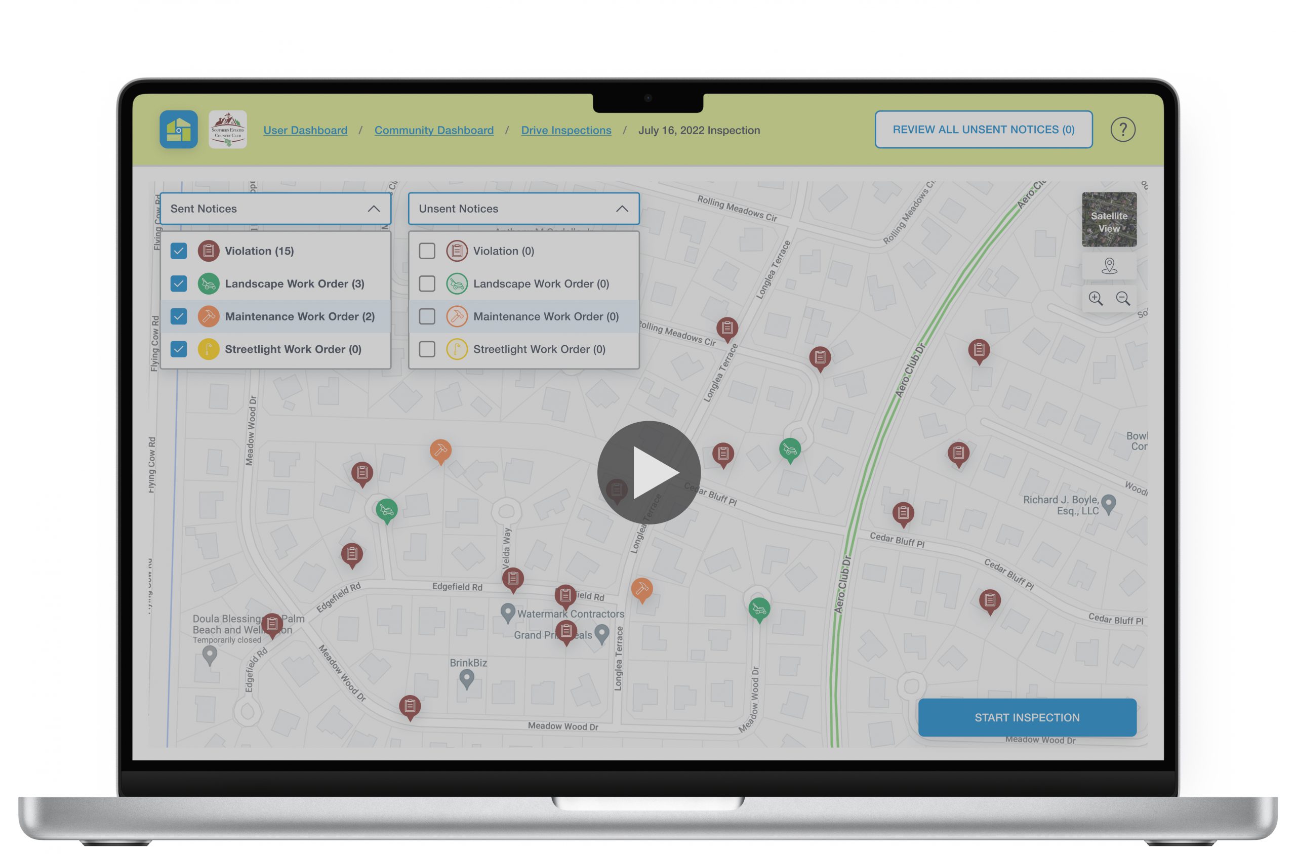
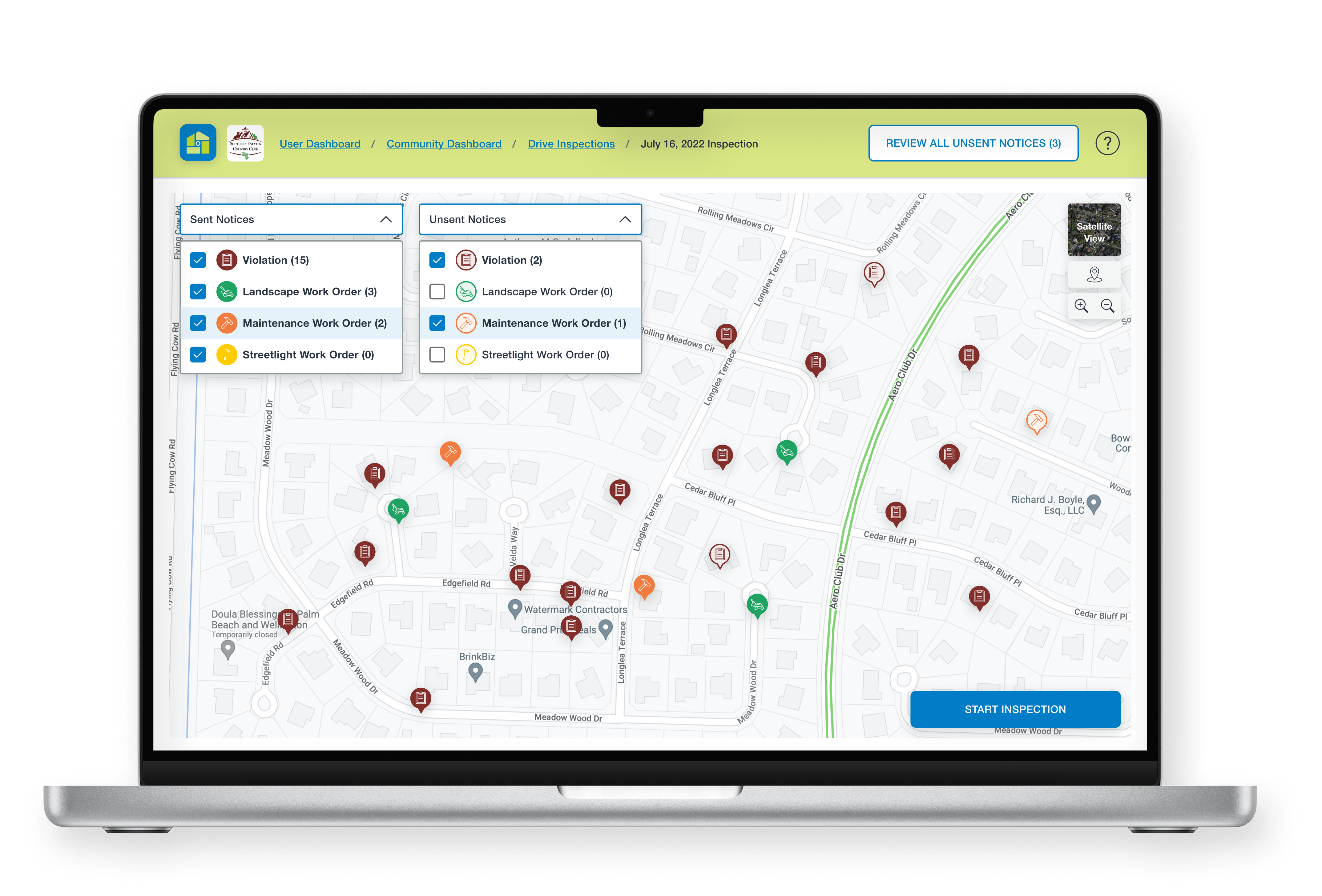
Screen 1: Map View of Community Overview
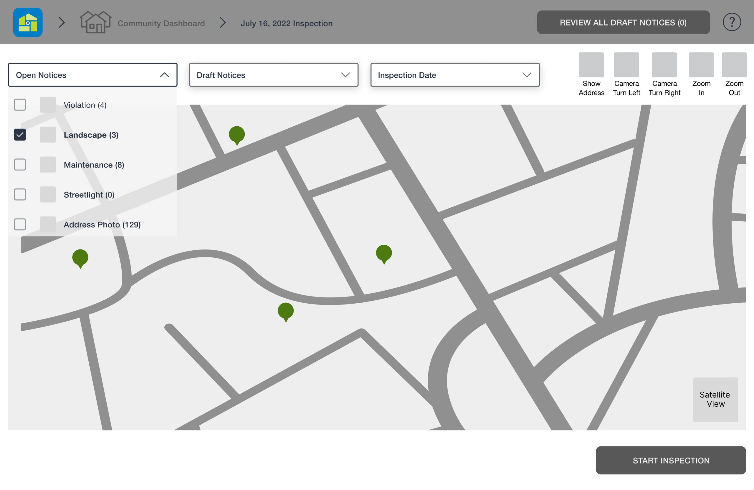
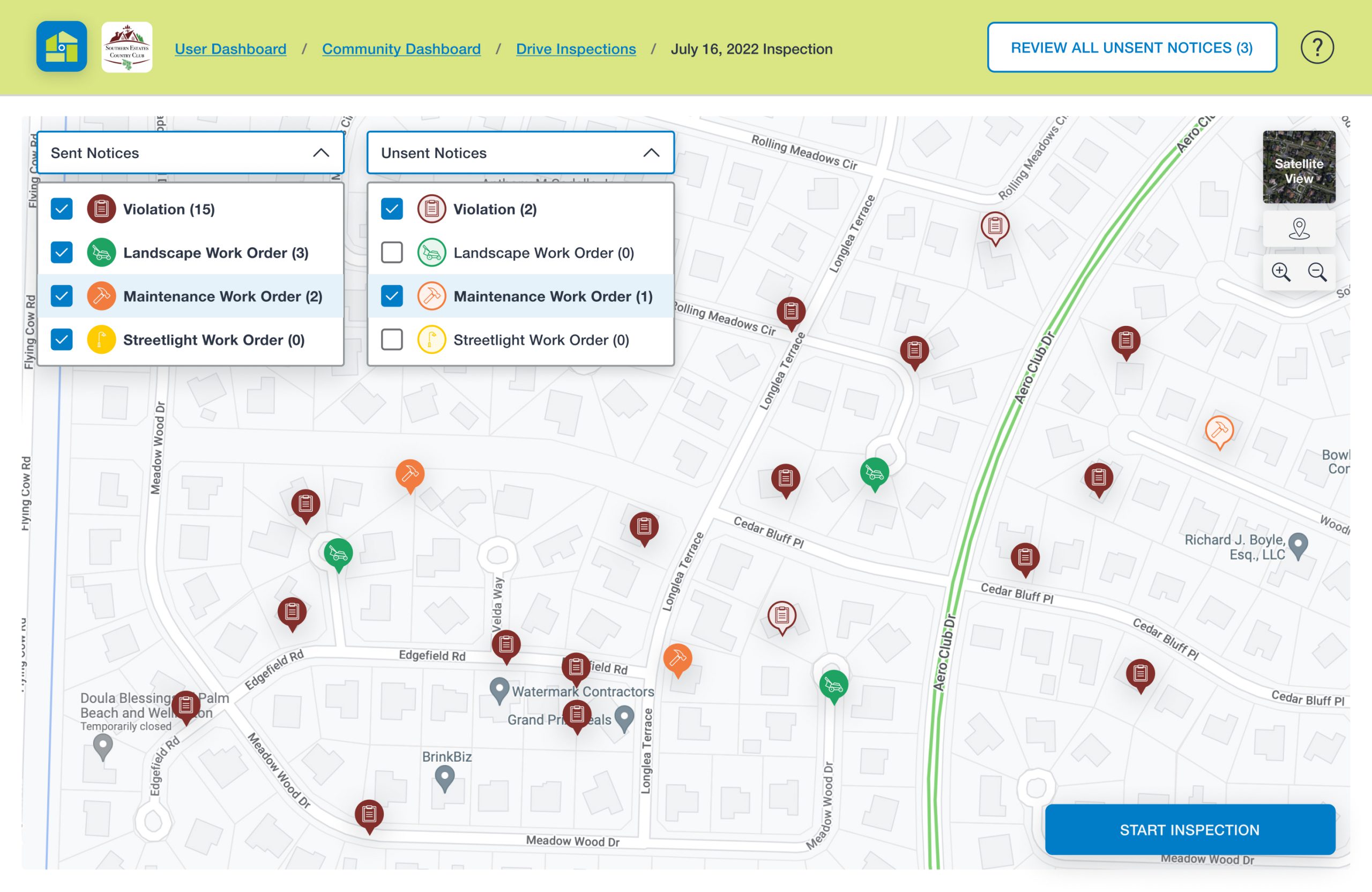
We felt it was necessary to start the inspection process by seeing an entire overview of the community, and the locations of previously sent notices with the use of pins. The pins are color-coded by notice category with the corresponding category icon. Sent notices from previous inspections appear as filled pins, while unsent notices from the current inspection appear as unfilled pins with colored borders.
What we iterated: We reworked the map, such as minimizing the border around the screen for a larger, more balanced view, and placing dropdown menus, map controls, and buttons directly on the map so it looked more cohesive.
The client also requested that we change the verbiage of “Open” and “Draft” notices to “Sent” and “Unsent” notices.
Screen 2: Map and Video
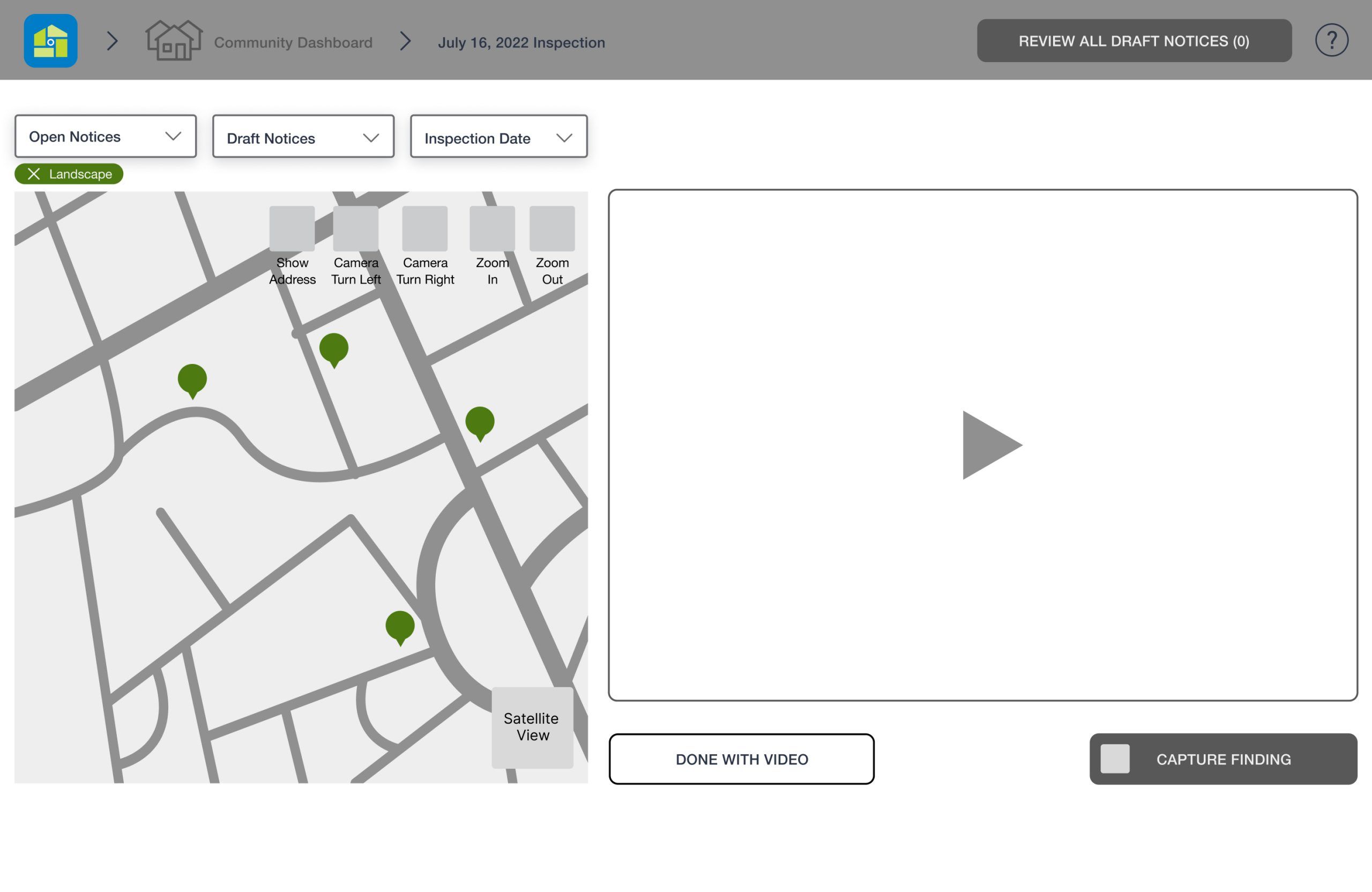
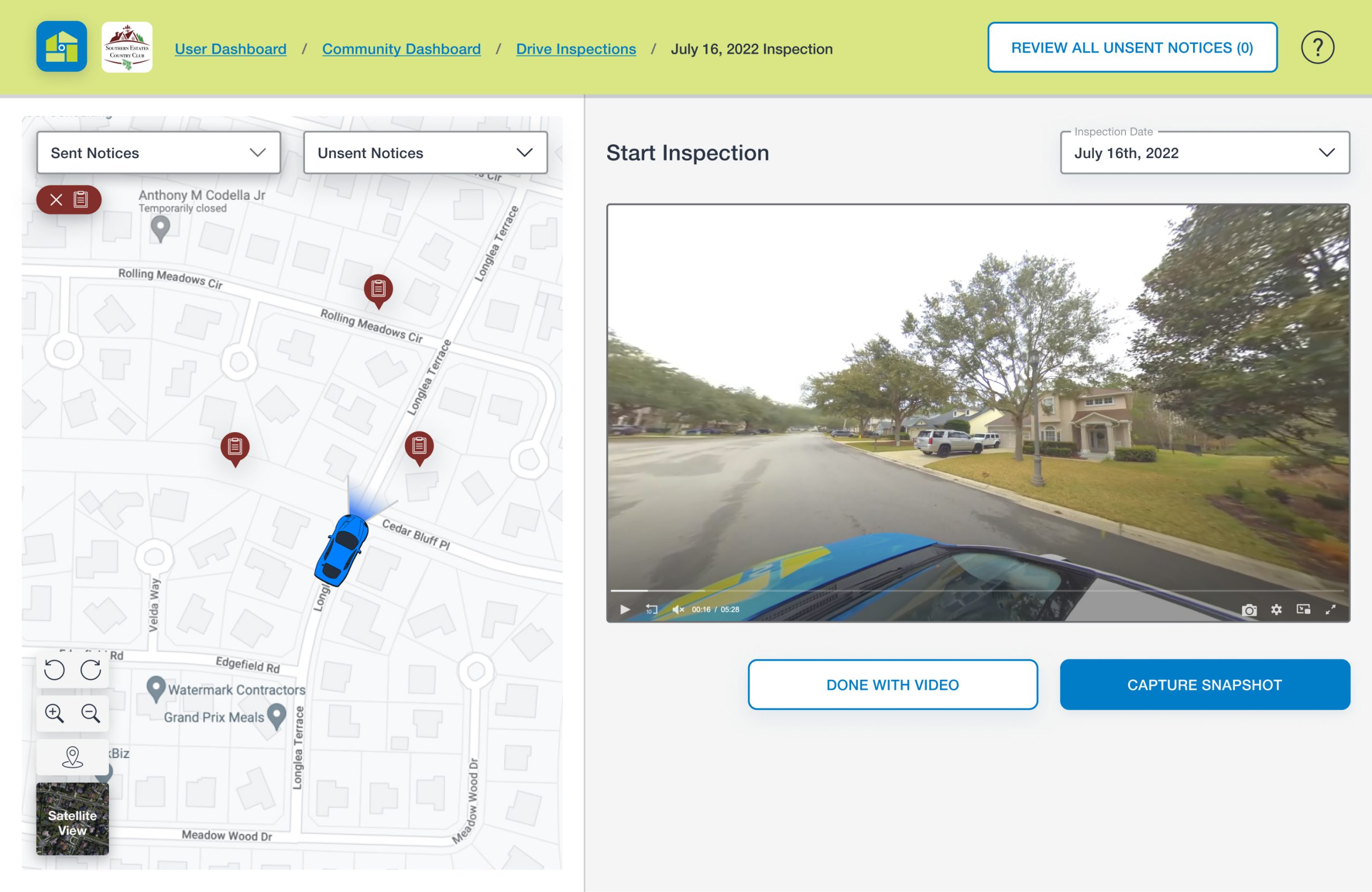
Once users “START INSPECTION” on Screen 1, the map shrinks and the inspection video appears. In our user interviews and testing, we found that viewing the map and video on the same screen to inspect properties was vital.
What we iterated: Again, we reworked the spacing and shifted elements around. One update we felt was particularly important was to move the “Inspection Date” dropdown menu to a more intuitive spot, directly above the video (and omit it from Screen 1). The idea was for users to more easily toggle between different dates’ video inspections.
We also included more headings (for instance, “Start Inspection” on Screen 2) to help guide users through each step of logging a notice.
Screen 3: Create a Notice
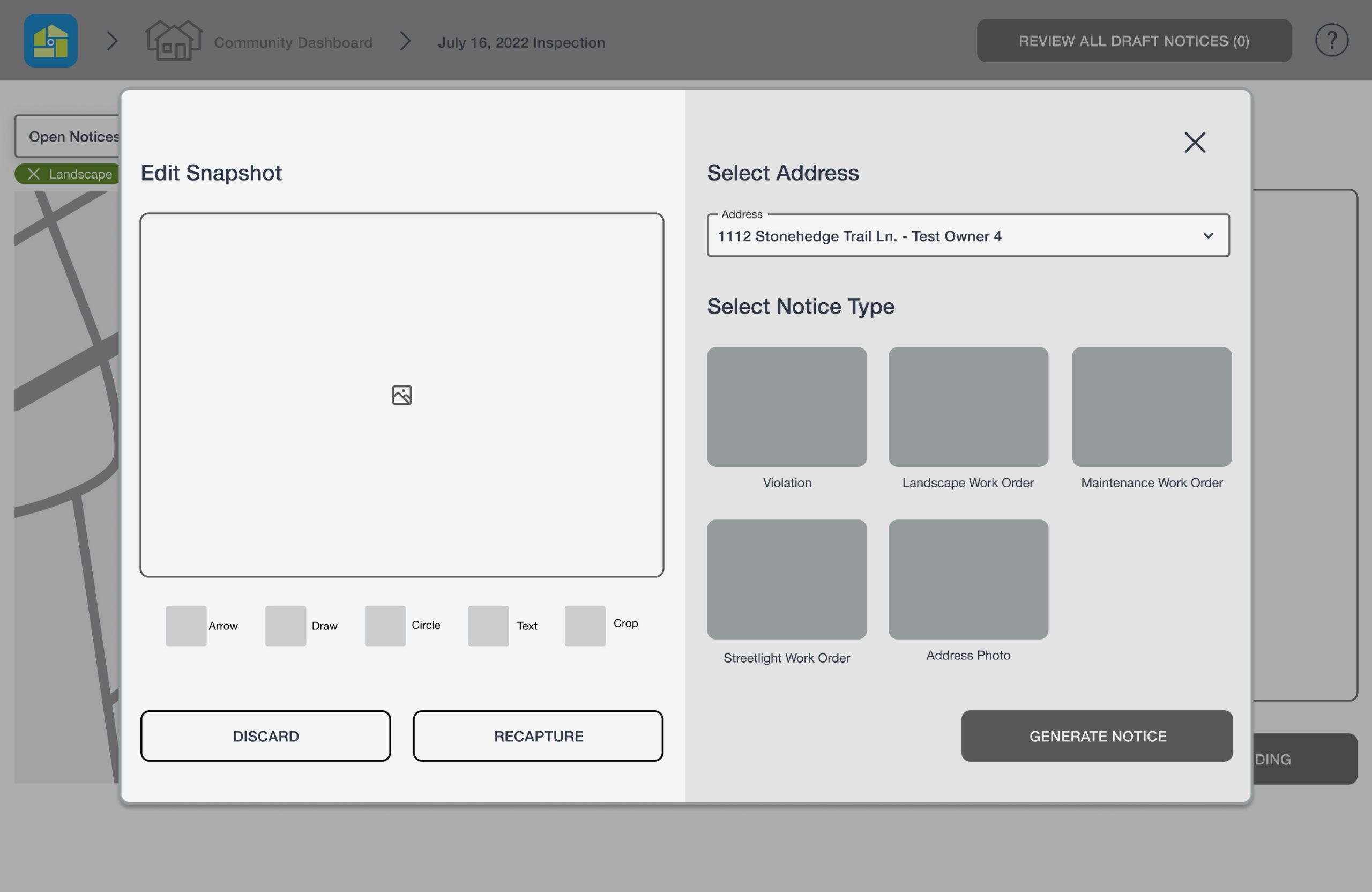
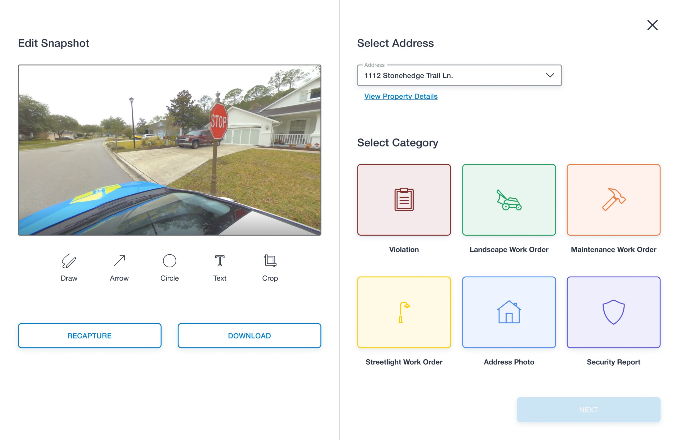
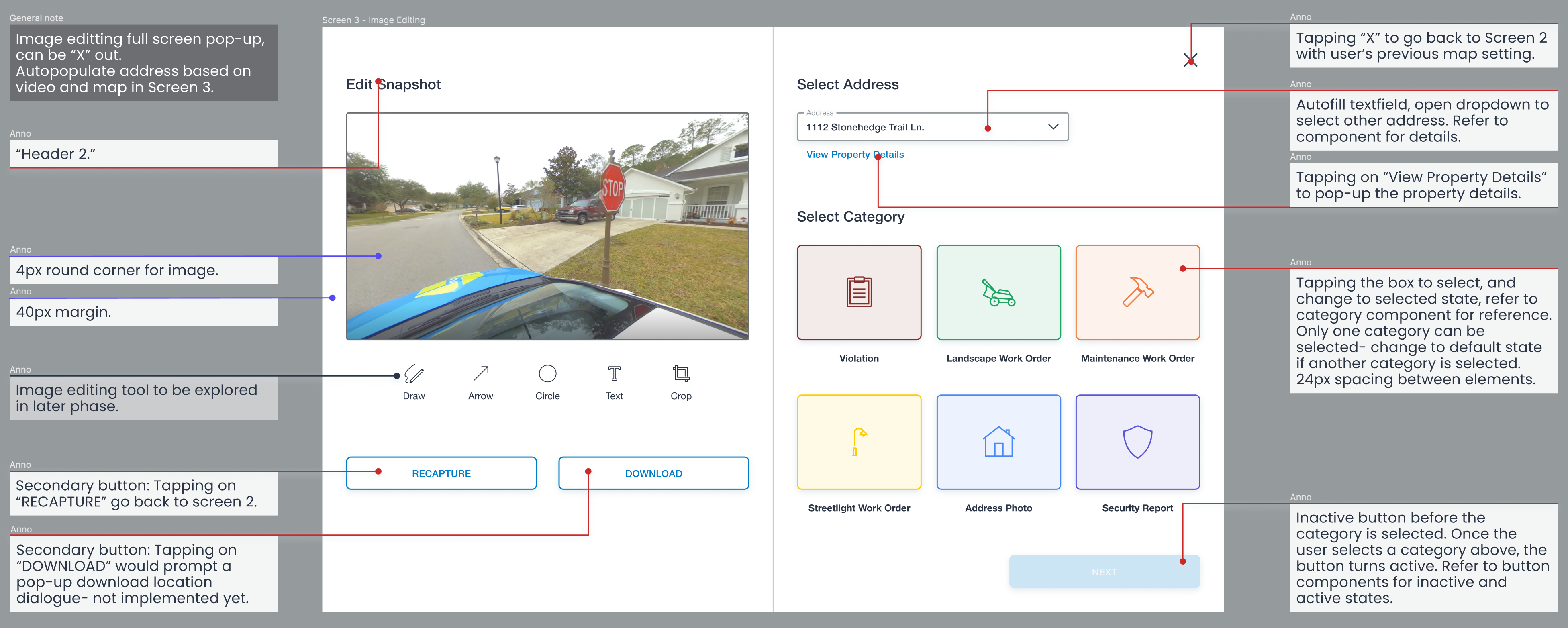
When users find an issue in the video and click “CAPTURE SNAPSHOT,” they are able to begin the notice in three simple steps: editing the snapshot, confirming the address (which is systemed to automatically select based on the map and video positioning/view), and selecting a notice category. We found that the existing dashboard has too many steps for users to complete within one screen- which was a pain point, as it led them to miss steps while creating notices.
Another finding from our interviews was that there wasn’t sufficient error prevention- users would fill out the notice and attempt to save, but would have to restart if they missed a field. To solve this and have clearer communication, we decided to include an inactive button to our designs, until the user selects a category.
What we iterated: For convenience, we added a “View Property Details” link to a pop-up window for users to refer to while creating a new notice. To avoid having two concurrent pop-up windows, we made Screen 3 to be a full screen modal. Users are still able to easily exit out of the modal by clicking the “X” or “RECAPTURE” button.
The client also asked us to include the “Security Report” category. All of these category buttons are newly designed, thus a fresh update to the existing colors and icons.
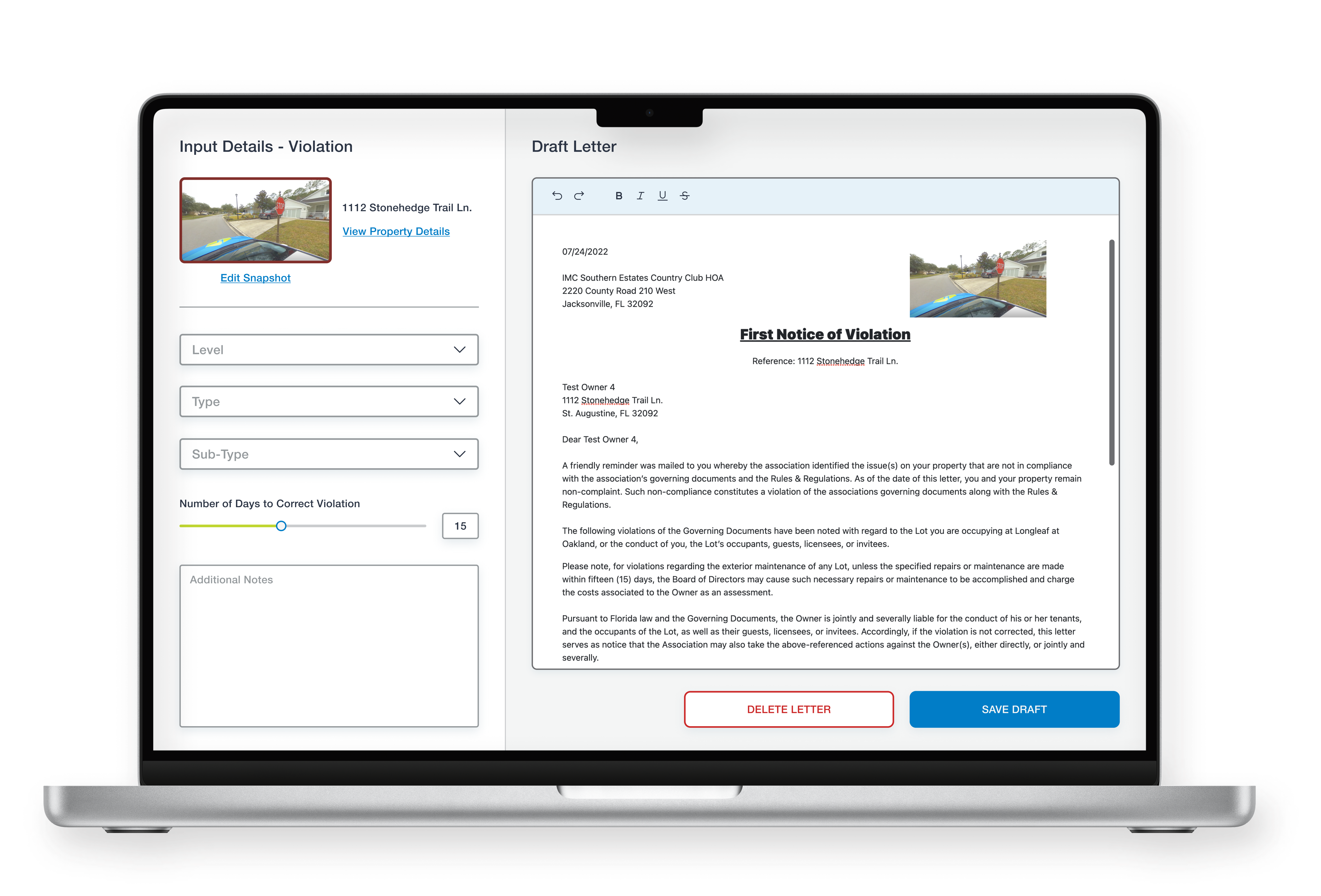
Screen 4: Input Details and Draft Letter
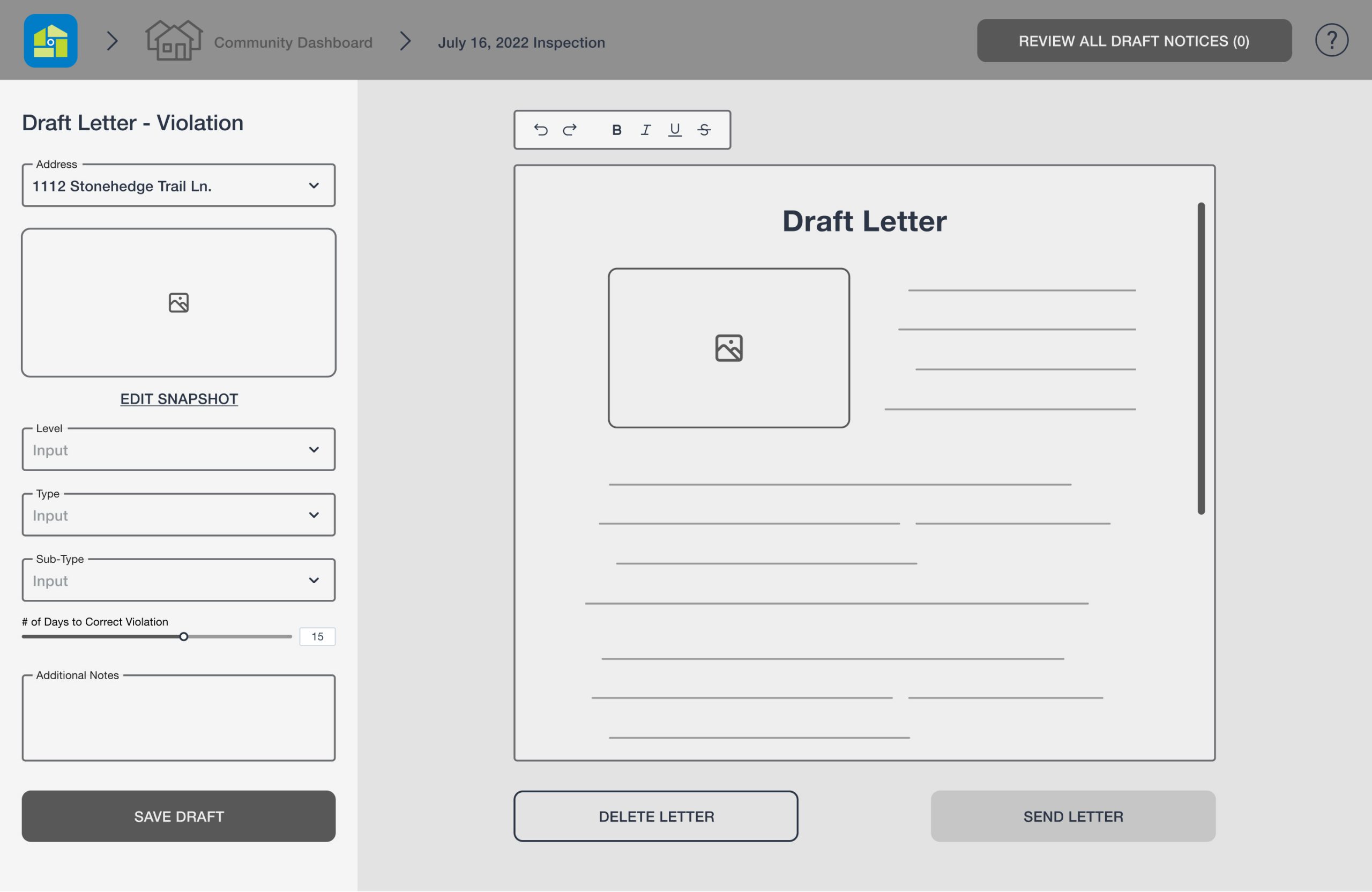
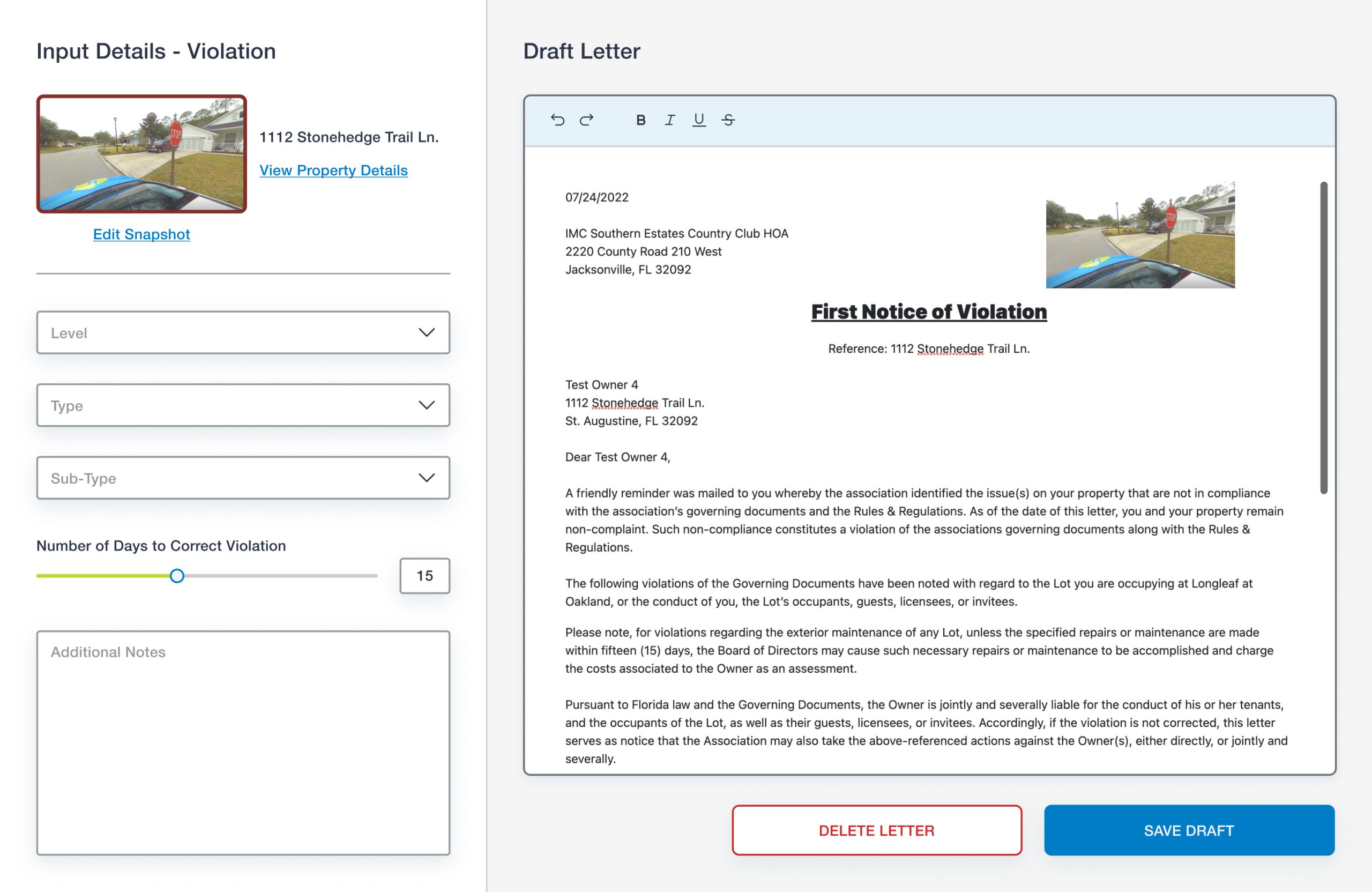
My team and I felt that the details of the notice should be on a separate page from the initial notice creation input (Screen 3) to minimize information overload. Users have the control and freedom to return to Screen 3 and edit the input by clicking on “Edit Snapshot.” We also simplified the letter editing toolbox with the use of icons, as the existing dashboard uses primary buttons for the editing tools (such as bold, italic, and underline). When the user completes the notice, they are then directed back to Screen 2 to continue their inspection process in a smooth flow.
What we iterated: At this point of the notice creation, users have a goal in mind, therefore the header was unnecessary on this screen. To maintain consistency, we added a colored border around the snapshot that represented the notice category.
Screen 5: Review Unsent Notices
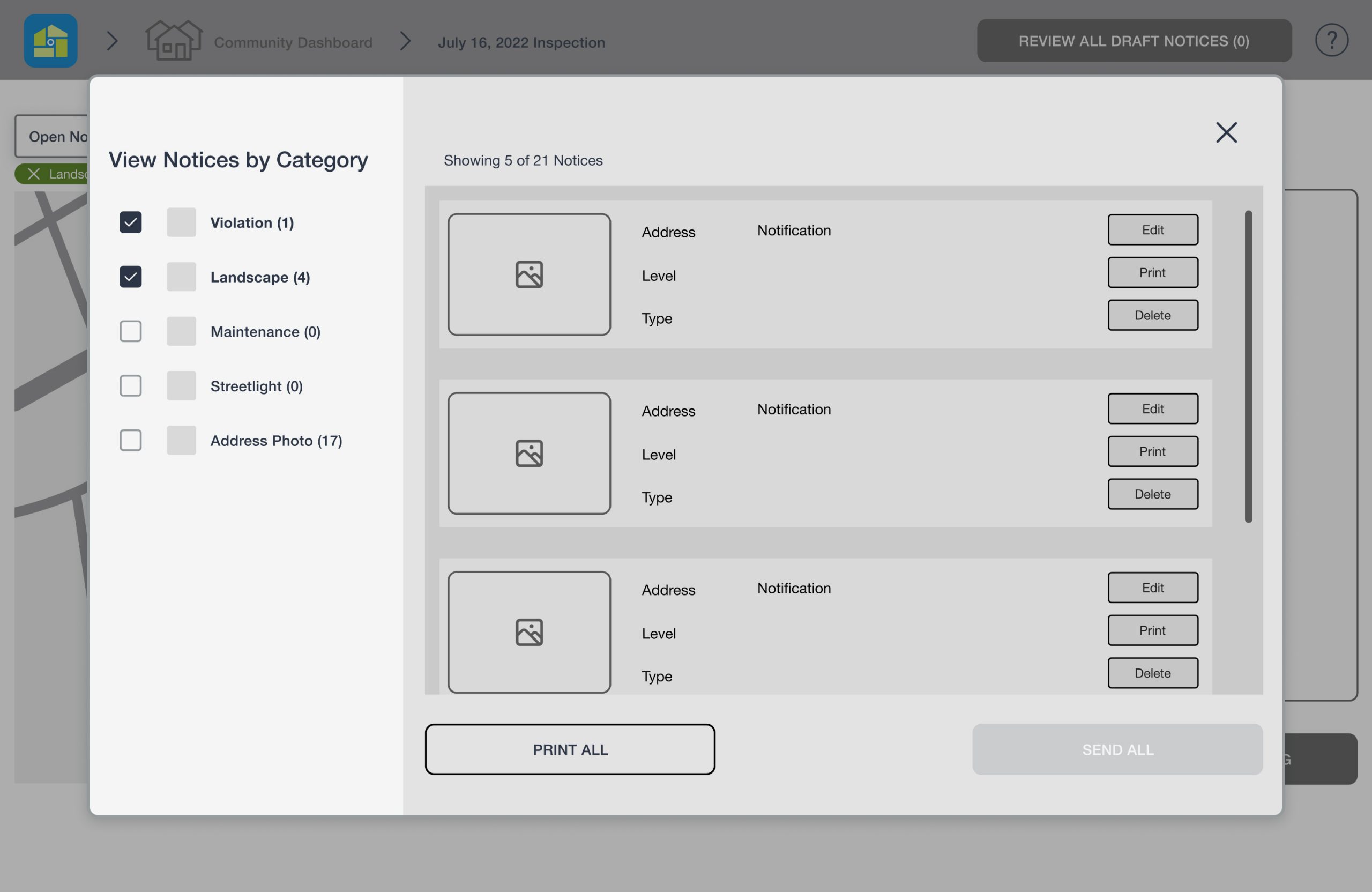
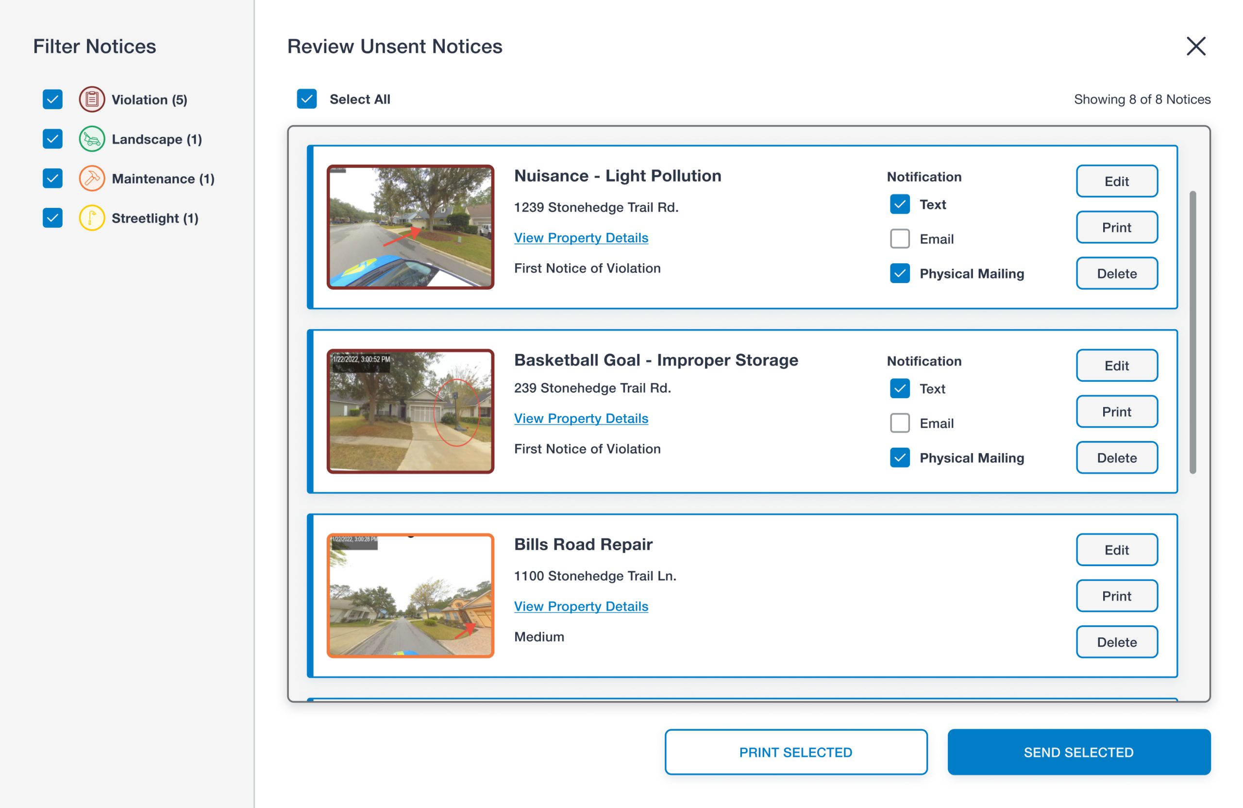
Once users are done creating all notices for the inspection, they click on the “REVIEW ALL UNSENT NOTICES” button in the header. The button also includes the number of notices created thus far in parenthesis for users to stay informed. It was important to display a list of all the new notices created and to be able to edit, print, and delete each individual notice.
What we iterated: Similarly to Screen 3, we felt this pop-up should be a full screen modal, giving users more visibility of the unsent draft notices (as some users will be creating hundreds of notices). During our usability testing, one user mentioned that it would be beneficial to be able to “Select All” and “Deselect All” notices, so we implemented that feature.
Screen 6 (Pop-Up): Sent Notice Details
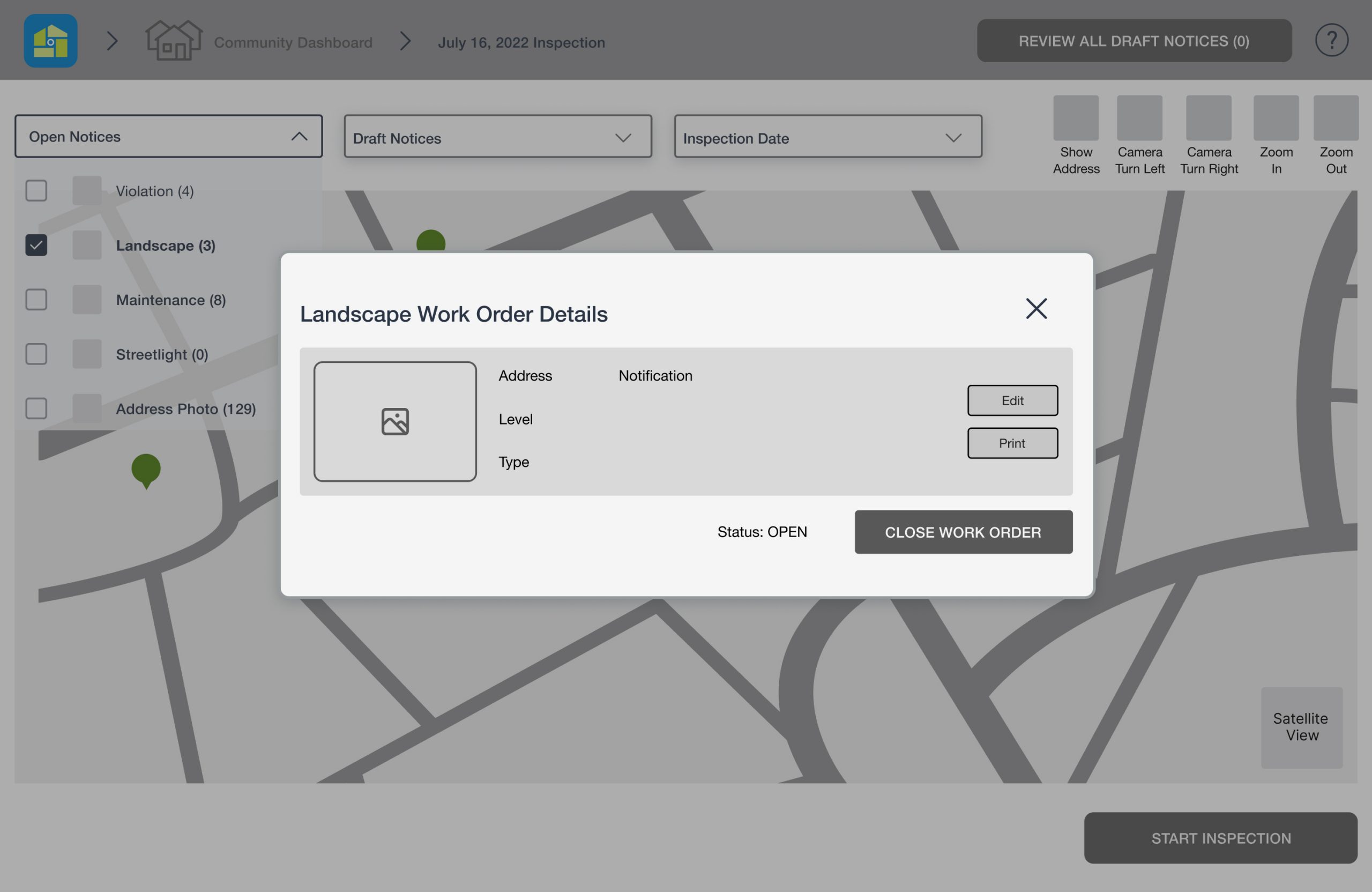
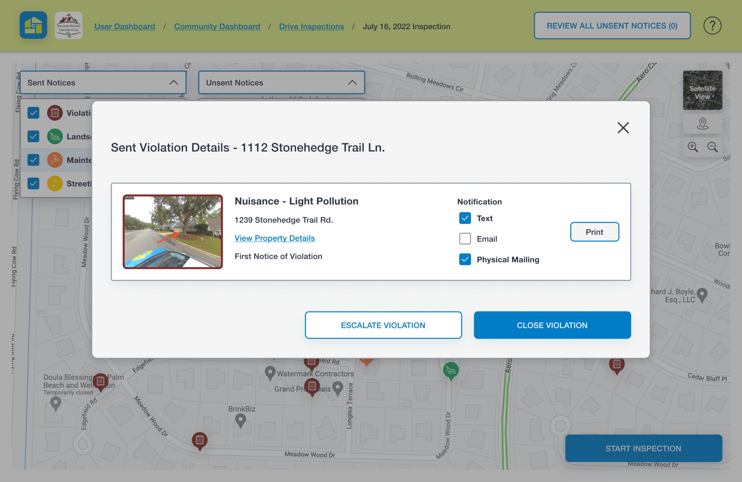
The last main screen we designed was a pop-up showing the details of a sent notice from a previous inspection. This can be viewed when users click on each filled pin on the map to determine if the violation/work order has been completed or not.
What we iterated: During our usability testing, users mentioned they wanted to be able to escalate the sent violation if no action had yet been taken. We included this as a secondary button.
Another feature that users wanted access to was the “View Property Details” function. The property details pop-up contains, for example, the homeowner’s information and the property’s violation history. This pop-up is also accessible directly from the map. When users toggle on the button that enables address numbers to appear, they then click on the desired address number and can view the property’s details.
Handoff to Developers
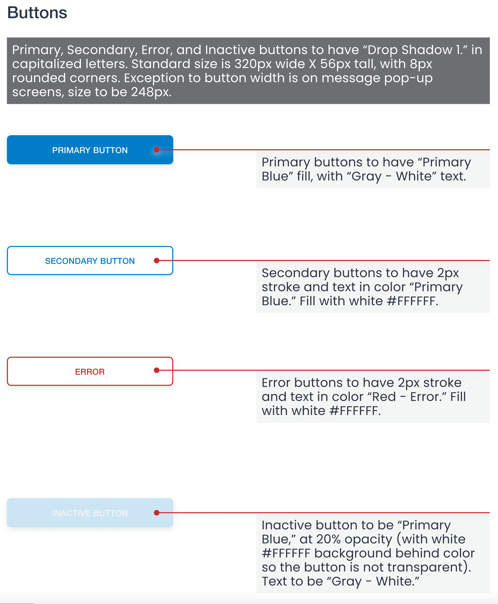
We successfully presented our final solutions to the client and received great feedback, but our work was not done! We prepared all screens with detailed specifications, along with components and the style guide for developers to refer to once they started building the designs. Below are examples of the handoff contents we created.
Conclusion
Next Steps
In four weeks, we were able to deliver much more than we had expected. The client was very pleased with our work, yet there was still a lot that we wanted to look into. We had to continuously stick to the deliverables we promised the client at the beginning, and not go too far beyond the time limitations. If we were given more time on the project, we would have performed more user interviews and usability testing to identify additional needs/frustrations and usability issues.
Other functions we would have liked to examine closely were:
Explore other essential snapshot editing tools (for example, finetuning the snapshot with brightness, clarity, and exposure).
Design other notice category flows, such as landscape work orders, as we only did the flow to create a violation.
Responsiveness to various screen sizes. We found that most users complete inspections on their desktop or laptop, which is what we designed for, but in the case they use a tablet or their phone, our designs would need adjustments.
Final Thoughts
Working with the CEO and two other UX designers was a rewarding and educational experience. I learned the importance of collaborating closely with not only my internal team members, but also the CEO and developers of the company. We made a conscious effort to ask for the client’s feedback for every design decision we made during our meetings, and made sure that the developers were kept up to date during the entire process. During our final meeting, we also let the clients know that we were more than willing to answer any questions they may have later about our designs, especially once they started building the updated product. Communication and alignment to expectations were key to the successful outcome.
Thanks for stopping by! 
More Projects
Get in touch!
Email
ncterada@gmail.com
Social
LinkedIn
Made with 

